Meet Origin, the heart of the Lightspark identity. The mark is a play on the orthographic grid, derived from the X, Y, and Z axes in the cartesian coordinate system. It's also a nod to the right-hand rule used in the study of electromagnetism.
Download assetsLogo Usage
The Lightspark identity is built on clarity, utility, and intentionally minimal. These guidelines ensure consistent usage of the Lightspark brand across all surfaces, helping teams create experiences that feel focused, coherent, and trustworthy.
Primary logo. The primary Lightspark logo combines the symbol with the wordmark. The wordmark is set in a custom variation of Suisse Int'l. The logo is available in dark and light variants and should be used on high-contrast backgrounds or photography.


Origin symbol. The Lightspark symbol is the most distilled expression of the brand. It may be used on its own in situations where the wordmark is not required, such as small-scale applications or product surfaces.


Spacing. Spacing defines the minimum buffer around the Lightspark logo that preserves its visual integrity. This area should remain free of text or graphic elements, even when the logo is placed on photography.
In the diagrams, "x" denotes the minimum required clear space for each logo variation. The "d" represents the wordmark's descender depth, which is mirrored above the cap height to optically center the logo.


Partnership lockups. When pairing partner logos with the Lightspark logo, use the primary logo in monochrome black or white. When available, partner logos should also be presented in monochrome to maintain visual consistency.
When pairing with wordmarks, align logos optically rather than by cap height. For lowercase or mixed-case partner logos, alignment should be based on the visual center or x-height to ensure balanced vertical alignment.
If the partner mark is symbol-only and the Lightspark wordmark is not required, the Lightspark symbol may be used in place of the primary logo.
Spacing rules apply to all partnership lockups, as shown below. A rule line is used to visually separate logos and preserve clarity.


Incorrect usage. Do not alter the logo in the following treatments.
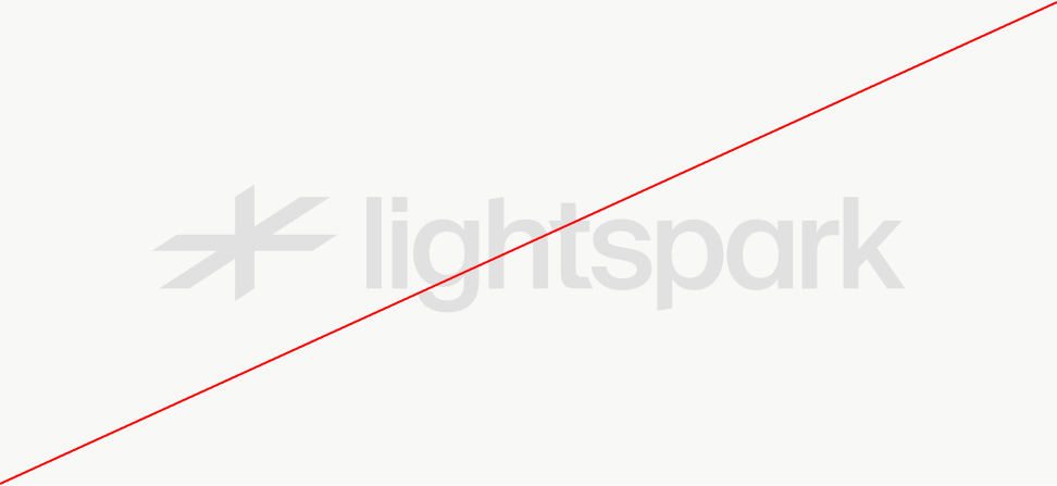
Do not use low contrast
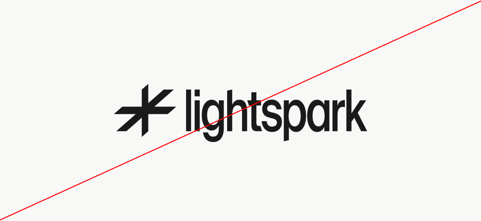
Do not stretch
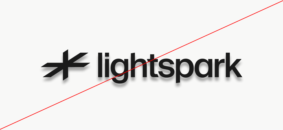
Do not apply effects
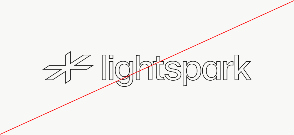
Do not outline
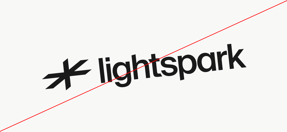
Do not position on an angle
Download our logo
If you have questions, or need help please contact our design team at support@lightspark.com
Download assets